


Exploring Artworks: Elio Cruz’s ‘Portobello Table One’
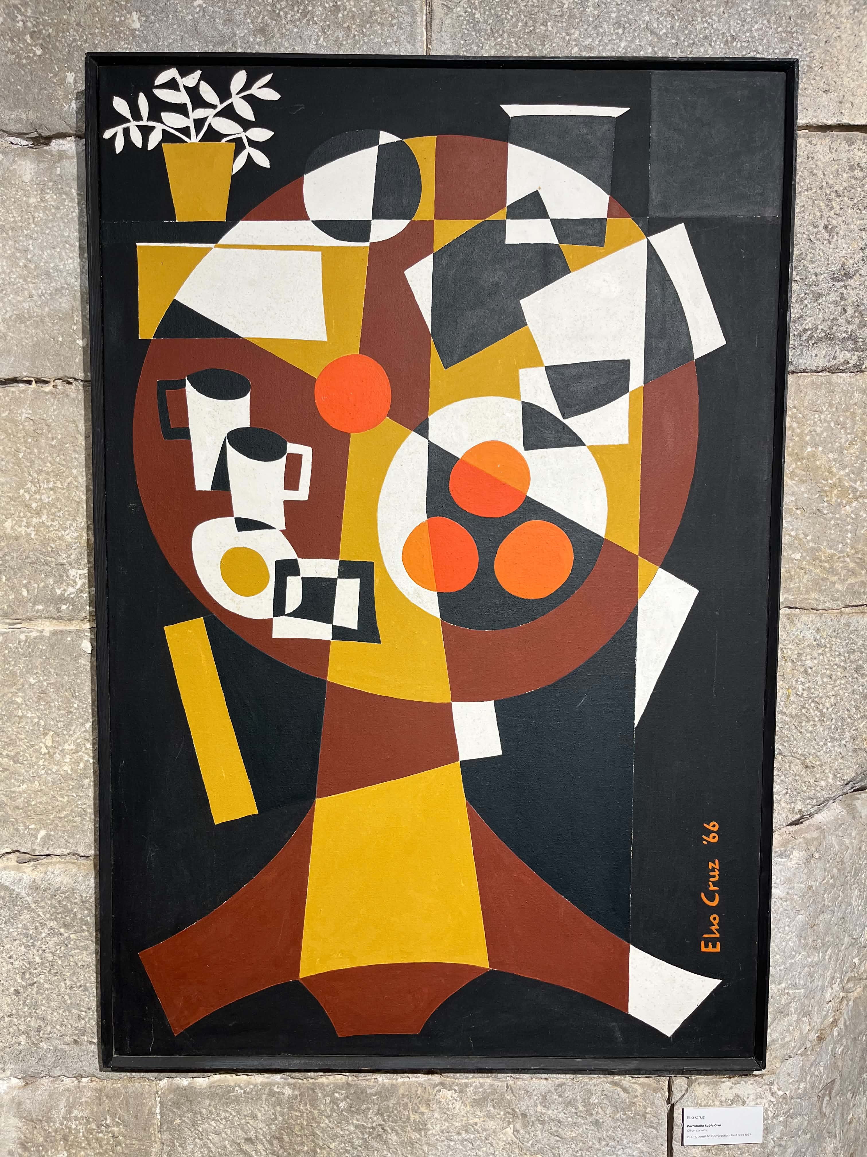
Today we turn our attention to ‘Portobello Table One’, a painting by Elio Cruz currently on display at the GEMA gallery.
Elio Cruz was born in Gibraltar in 1931. He moved to London in 1958 where he worked as a teacher. Although Cruz lived and worked in the UK from then until when he passed away in 2019, he was in constant contact with artists and theatre groups on the Rock and made important contributions to local culture.
Cruz was a creative man of many talents but he is chiefly remembered for his Llanito plays. His most well-known play, ‘La Lola se va pa Londre’, presented Gibraltarian society and the intrigues of patio life during the 1950s and 60s. Cruz was also a poet, photographer, and set designer. He also produced many posters for cultural events.
As a painter, Cruz was influenced by the numerous abstract art movements of the early 20th century. He won awards locally at the Calpe Artists’ Competition in 1956 and again in 1957 for his paintings ‘View From Europa’ and ‘Carnac’. In 1960, he secured the top prize for the First Gibraltar International Art Exhibition for his collage, ‘Hibiscus 3’. In 1967, he took the top prize in that year’s Gibraltar International Paintings Exhibition with ‘Portobello Table One’ which we analyse below. Cruz was posthumously awarded the Gibraltar Medallion of Honour.
The casual visitor to an art gallery might feel a sense of puzzlement when confronted with a Cubist work like this one. What does it represent? Why are things the “wrong” shape? Art that is even more abstract or conceptual than Cruz’s work can even provoke feelings of frustration or anger: how can this be art, one might protest, anyone could have done this. But even a reaction of incomprehension is significant. In the words of the philosopher of art Alexander Nehamas: “To pay attention to something, if only to revile it, is already to have set it apart from an immense throng of undifferentiated, and indifferent, objects.” Just by pausing in front of a painting that we find problematic is to have our attention drawn away from the world and towards the shapes, colours and forms that have been intentionally arranged in a certain manner by an artist.
The interpretations offered by artists, teachers and enthusiasts below show that, to understand a piece like this, we have to look beyond whether it shows the world accurately—we should start, instead, by noting the work’s formal properties: its balance, composition and palette and how these interrelate.
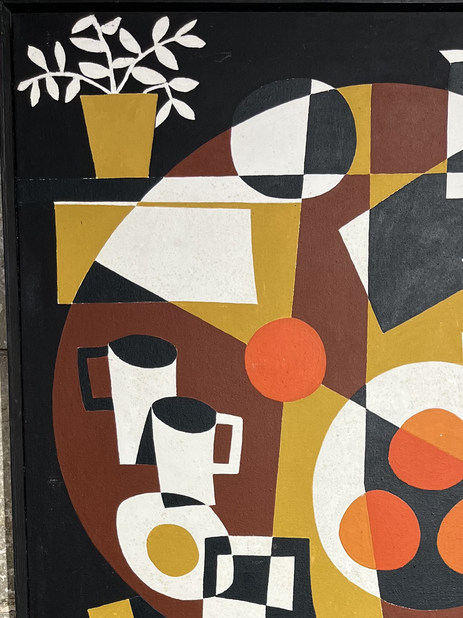
We again join artist Shane Dalmedo who works at the GEMA gallery to ask her for her impressions: “One senses the colours and aesthetic of Portobello, a fashionable part of London in the 1960s near where Elio lived. There’s a limited palette and it’s very compact—it’s like the objects are going to explode. We can see what seems like a breakfast table; there’s food, drinks and mail there to be read. The plant (top left) reminds me that he was very proud of his garden. There’s an illusion of depth framed, and a shadow cast by the cups, despite the flatness. In this painting, everything is presented to us.”
Stefano Blanca Sciacaluga of Kitchen Studios, starts off by saying that Cruz’s art is “hugely underrated.”
He continues: “There’s very little mystery as to what this painting is about: it seems like an abstract piece, obviously, and it’s a set table of some kind. It gives me the idea that it’s a sobremesa, so maybe it’s a meal that hasn’t finished and it’s time for dessert or coffee but it could also be breakfast. The papers on the table might show that someone was working on something.”
Stefano admires the painting’s modesty: “I think it’s also one of these pieces that touches on mundane, everyday views and everyday items. It’s not trying to be anything it’s not; it’s not trying to be anything spectacular or trying to show off.”
He adds that the painting is very much a product of its time and that it plays around with our expectations of light and dimension: “It’s a very 60s design and palette. It could easily be something that you’d see across graphic design of the time. It moves with different dimensions and through different views. It’s not all flat and it’s not 3-D. The mugs do cast a shadow and you can see that there is definitely some light at the top of the painting. That’s what makes it interesting and that’s what makes the viewer want to stick around maybe a tiny bit longer on viewing it.”
Kyrane Lia, an Art teacher at Westside School, places Cruz’s work in wider art-historical currents: “The piece immediately engages with Cubism and modern abstraction. Cruz tilts the tabletop forward into a flattened, circular plane, allowing us to view objects both top-down and sidewards. The painting is also broken into sharp, interlocking geometric shapes such as triangles, arcs, and trapezoids giving a dynamic visual movement to an otherwise still and quiet subject. The colours are quite interesting too, with bright oranges giving a drastic contrast to the black and white shades.”
Kyrane says that what stands out, to her eyes, is how Cruz “balances chaotic geometric fragmentation with incredible stability.”
She continues, imagining how the musical properties of the work trigger associations: “The flared base and central vertical ground the piece, harmoniously acting with the interplay of light and dark planes creating a rhythmic and almost musical rhythm across the surface. I feel as if I can actually hear music, reminding me of perhaps a tea time whilst listening to comfort music with family or friends.”
We also contacted writer and retired teacher Humbert Hernandez who knew Cruz: “I hadn’t seen this painting for a long, long time. It’s part of a series about a table he bought in Portobello Road and which he had in his flat in Notting Hill Gate. His style is spare, neat and painstaking.” he says.
Humbert continues, filling in more details regarding Cruz’s creativity: “Elio was so creative—he was never still. If he wasn’t writing a play, he was writing a poem or an autobiographical piece. He was also absorbed with painting, even weaving, producing some marvellous rya rugs too and designs for posters for theatrical productions and set design. He was a marvellous thinker; ideas just poured out of him and anyone who was around him became inspired by him.”
Artist Karl Ullger, who is head of Art at Bayside School, also added to our understanding of the piece. He said he can detect the influence of the French cubist Fernand Léger (1881–1955).
Karl continues: “It’s disjointed: he seems to have gone for a bird’s-eye view but the mugs, for example, are from a first-person view. He has explored multiple viewpoints, which is what Cubism is all about.”
Karl notes that the top right hand corner of the paining is several tones lighter than the other parts of the painting, arguing that Cruz used this to balance solidity and emptiness.
“The corners of some works sometimes have paintings within paintings. The artist has considered every part of the canvas; for serious artists, every single mark is intentional. Here there’s this lighter panel that sets an equilibrium, it balances out.”
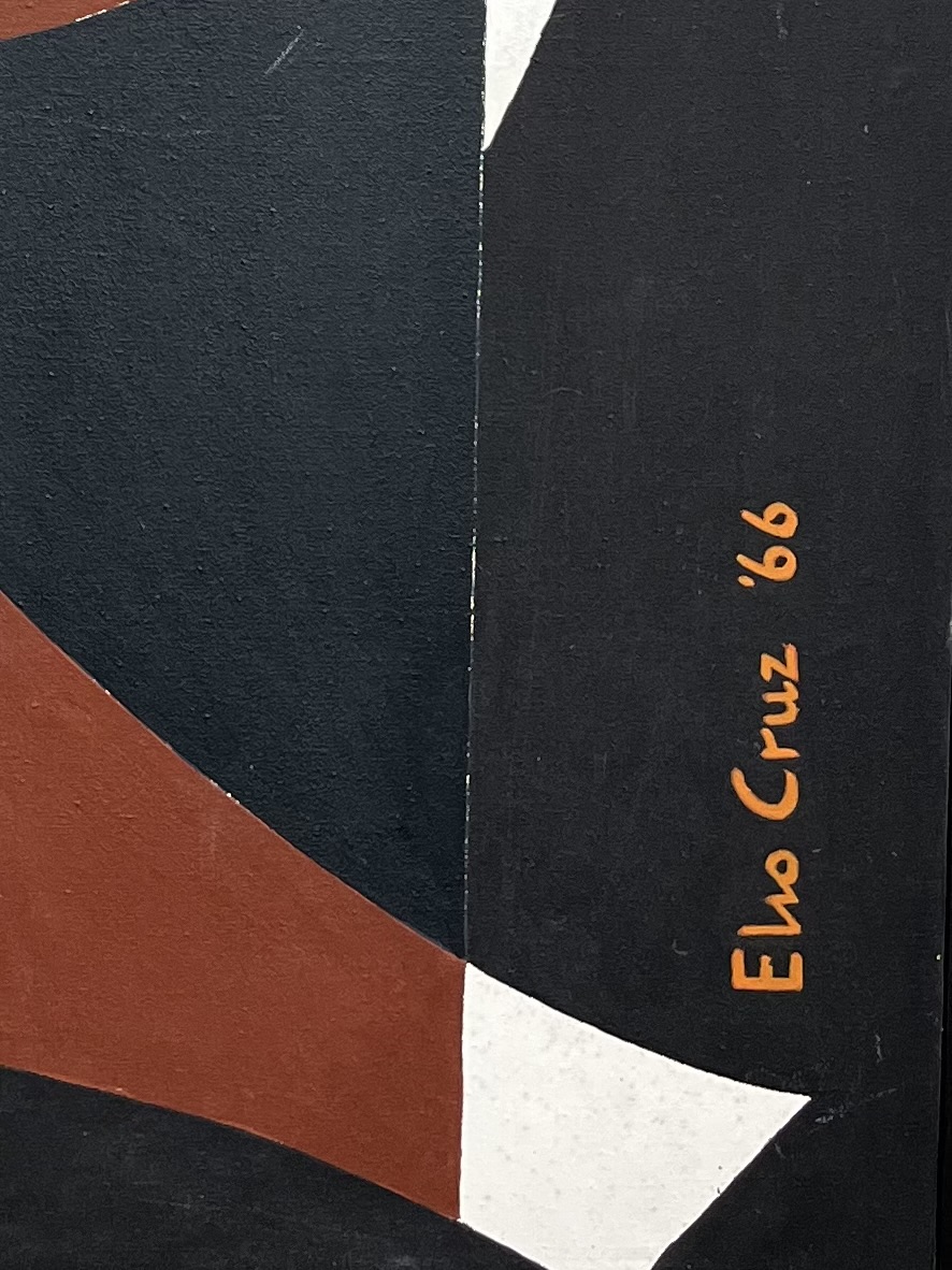
Turning his attention to the artist’s signature on the bottom right, Karl says:“This is very interesting. Dalí, Picasso and Miró would sign their names within their work—it is part of the design, within the structures and landscapes you find the artist’s signature. Here, Cruz has done the same; he wants us to treat his signature as part of the design. It’s straight or upright because it has to create equilibrium with the yellow ochre rectangle on the left.”
He praises Cruz’s composition: “It’s not an arrangement of random objects, it’s all been thought out. It’s recognisable as a table and the artist has made the viewer think, which is one of the points of art.”
Artist Lorraine Buhagiar also provided a detailed analysis: “Elio Cruz was a multi-talented artist who, with his painting ‘Portobello Table One’, has left us with a strong piece of social history.
“This minimalist work depicting a table may have been inspired by a piece of his own furniture, the Portobello style being typical of many a 60’s household, or perhaps the inspiration was taken from a scene played out on the famous Portobello Road itself. ‘Portobello’ was used to reflect the eclectic trends of the market, loaded with bric-a-brac and historical and quirky items. As a creative living in London in the ‘swinging sixties’, the market must have been a place he was familiar with and no doubt frequented.
“Cruz’s painting tells a story, capturing the spirit of the age. The colour palette is evocative of the 60’s: autumnal, earthy tones and the warmth of the orange dominated interior design at this time. As I was born in the 60’s, this really resonated with me, filling me with nostalgia and taking me on a trip down memory lane to my early childhood. A time of matching crockery and placemats and the table was always laid!
“Two mugs placed side by side gives a feeling of intimacy, the fried egg, fruit and newspapers or possibly menus, suggest breakfast time. A little disorder is created by a stray orange that sits on top of simple shapes and forms that cleverly overlap making the colours pop and make the scene busy, in an otherwise relaxed setting. The plant detail helps create a cosy corner and a homely feel. Wherever Cruz’s inspiration came from, perhaps a shared moment of calm had been enjoyed before the start of the working day.”
Finally, art enthusiast and cultural commentator Charles Durante said:
Charles argues that, although it is tempting to opt for Cubism as the most obvious style informing the piece, he says that close inspection shows that some of the more obvious characteristics of Cubism are missing.
He explains: “There is no fragmentation of forms, no distortion of conventional shapes, and Elio eschews plastering his painting with helpful tags like ‘vin’ (as in Picasso’s Verre, Bouteille de Vin, 1914) or ‘le journal’ (as in Juan Gris’ Glasses and Newspaper, 1914) as in a typical collage. Instead, he flattens his objects, simplifying them and reducing them to basic geometric shapes.”
Looking closely at the table, Charles says: “Interestingly, the way the impression of a circle is created endows the painting with the simulation of movement so that what is obviously a still life seems to move like wheel with the solitary orange as the slightly off centre of the design. The movement itself appears to be clockwise.”
He also discerns a connection with the letter “P”: “If, in our mind’s eye, we remove the objects on the table, the letter P emerges, a P which is coloured brown and has a very sturdy downward stroke as if holding all the objects on the table in place. The P is reminiscent of the historiated capitals which adorn medieval illuminated manuscripts. The monks usually filled these huge letters with scenes derived from the main body of the text. We have something similar in our painting: the painter has gathered a collection of objects which denote domesticity and nutrition, what we would associate with breakfast or some other family meal.”
Charles adds that Cruz has given everyday objects an aesthetic significance: “All the branches of modern art rejected the overwhelming influence of mimesis: art does not imitate a separate reality but creates its own world which floats freely in the contrived space created by the artist. Elio Cruz has achieved this freedom by raising everyday objects into art forms. As in Cubism, there are no cryptic symbols, no esoteric messages; instead, the ordinary and quotidian is endowed with artistic meaning by being incorporated into a work of art which expresses our daily lives, objects which, according to Apollinaire, are ‘impregnated with humanity.’”
He ends by saying that while a still life is, by definition, static, the impression of inertness is “avoided in this work by the subtle way Elio has combined the forms so that they seem to revolve around a still point.”